

Recently, a Facebook group for freelancers that I’m in had an extensive conversation about sales pages. Why have they gotten insanely long these days? Have you ever scrolled for ages and ages to get to the bottom of a sales page and buy something? Surely for the pages to merit such length, they must be effective. Do successful people know something you don’t when it comes to sales pages?
Why Are Some Sales Pages A Mile Long? – Post Outline
Whether you’re in the business of writing, or just want to use writing to grow your business, you’re destined to cross paths with sales page creation at some point. Knowing the anatomy of a successful sales page makes writing one a lot less intimidating, so today we’ll go over why you need a sales page, which elements of a sales page are essential, and how to create a sales page yourself — even if you’ve never done one before.
Why Some Sales Pages Are A Mile Long
“I’ve only seen short copy beat long-form sales copy twice in my career.” — David Ogilvy
Sales page length depends on the knowledge level of your audience. As a quick review, no matter what business you are in, you have at any given time three and only three audiences.
#1: The informed audience
Informed audiences are aware that there’s a problem and are also aware of the solution. Perhaps these readers have consumed a lot of your content already. You don’t need to gush for hours on end to convince an informed audience that there’s a problem. If you know your audience is informed, you could get away with a shorter sales page, or spend more of your sales page real estate twisting the knife and persuading a prospect to act now instead of later.
#2: The afflicted audience
An afflicted audience knows there’s a problem, but isn’t aware of the solution (Or is seeking a different solution that will work for them). When writing for an afflicted audience, you need to introduce the solution first in a sales page, then sell it. Since there are more steps, your sales page needs more runway.
#3: The oblivious audience
The oblivious audience is a hard sell, but it is possible. That’s because these readers don’t think there’s a problem. Since these readers aren’t even really aware that there’s a problem, you need to introduce the problem, then introduce the solution, and then sell the solution. Translation: Long sales page. Sales pitches that target an oblivious audience usually need to twist the knife a lot early on and a paint a picture of doom and gloom, because the reader isn’t in pain.
Rather than create three sales pages for three separate audiences, you can get the job done with one sales page that works for all three audiences. A detailed sales page shows you that a person or business genuinely wants to answer all your questions and address your concerns. Even when we feel inconvenienced scrolling through a ton of the material, we’re reassured by the fact that the seller has taken the time and effort to address concerns of questioning minds. If a sales page has almost nothing on it, it’s actually a red flag.
Why Customers Actually Want A Long Sales Page
Some information will be repetitive for your afflicted or informed audiences, but that’s okay, because familiarity increases the probability of sales according to science. Repetition is important in sales and marketing; to quote a passage from the 1885 book Successful Advertising by Thomas Smith:
The 1st time people look at an ad, they don’t see it.
The 2nd time, they don’t notice it.
The 3rd time, they are aware that it is there.
The 4th time, they have a fleeting sense that they’ve seen it before.
The 5th time, they actually read the ad.
The 6th time, they thumb their nose at it.
The 7th time, they get a little irritated with it.
The 8th time, they think, “Here’s that confounded ad again.”
The 9th time, they wonder if they’re missing out on something.
The 10th time, they ask their friends or neighbors if they’ve tried it.
The 11th time, they wonder how the company is paying for all these ads.
The 12th time, they start to think that it must be a good product.
The 13th time, they start to feel the product has value.
The 14th time, they start to feel like they’ve wanted a product like this for a long time.
The 15th time, they start to yearn for it because they can’t afford to buy it.
The 16th time, they accept the fact that they will buy it sometime in the future.
The 17th time, they make a commitment to buy the product.
The 18th time, they curse their poverty because they can’t buy this terrific product.
The 19th time, they count their money very carefully.
The 20th time prospects see the ad, they buy what the ad offers.
The more people hear about your product, its details, and its benefits, the more likely they are to buy. Cold sales pages can work too, but to be effective the words on the page must elicit the right emotions in the right order. Here are a few examples I keep bookmarked:
- A recent sales page from Money Map Press, a powerhouse in the financial copywriting space, pitches this sales page to an afflicted/oblivious audience by stoking fear early on and introducing/reintroducing impending doom. (This sales page style, written like a letter to the reader, is called a video sales letter or VSL.)
- Personal finance author Ramit Sethi actually wants to build your pent-up desire for his Find Your Dream Job course, so his sales page is just an informational page. The real sales page gets introduced to you later, after you’re already on his list and have been yearning to learn more for days or weeks.
- Writer Nick Usborne and American Writers and Artists Incorporated have this sales page with no images or graphics whatsoever (Save for a few red ink overlays) that pushes a $497 information product. It’s pretty compelling.
- And of course, let’s not forget the legendary “Story of two men” sales page that generated $2 billion of Wall Street subscriptions from 1975–2003. A gently-annotated analysis of that sales page and its origins is here.
Price point also influences sales page length. If you’re selling a book for nine bucks, you don’t need a monster sales page. If you’re trying to charge a thousand dollars for an online course that delivers automatically without you lifting a finger, your sales page needs to do a lot of heavy lifting. For offers like service or consulting inquiries that are high-touch, it may be in your best interest to conceal prices and have your sales page call-to-action be to book a call with you or your salesperson instead, then close the deal over phone or video.
What To Include In Your Own Sales Page, Step-By-Step
I’ve put together a core sales page template that I personally like and use. This is a sales page I would use for an afflicted or oblivious audience; for smaller, more niche offers, I do a more pared-down version, which I’ll show you momentarily. We’ll start from the very beginning and work our way up, but here’s the complete sales page outline for reference:
- A compelling headline
- Social proof: Media logos
- Lede (“If, then” clause, story, reasons why they haven’t succeeded yet, and/or the one thing that will make a difference)
- Your product, its features, and its benefits
- One call to action & sterile checkout process
- Social proof: Testimonials
- Urgency triggers
- Call to action again
- A guarantee
- Social proof: Testimonials
- Social proof: Case studies
- Final call to action
The Must-Have Elements Of A Sales Page
Let’s build our template out like a human body and start with just the skeleton. At the very least, your sales page should have the following elements:
- Your product, its features, and its benefits
- One call to action
- A sterile checkout process
Your product, its features, and its benefits
“I’ll help you become happy, healthy, thin and rich!” you say to your prospect. Okay, but how? With a book? With lottery winnings? With a trip to outer space? Communicate what the offer actually is, and make it easy for me to learn more about your product, program, or service.
Tell me the details: The number of chapters, the type of alloy used for the metal, the duration of the Facebook group or online community, the types of templates or downloadable files, the gluten-free and naturally sourced ingredients. Then give me a sentence or two on why that feature will benefit me.
Here is part of the sales page for Oura Ring, a ring with sensors that track your sleep. One of its most prominent features and benefits is that Oura will capture information about the quality of your sleep and wakefulness, then deliver that information to you in three easy-to-understand metrics.
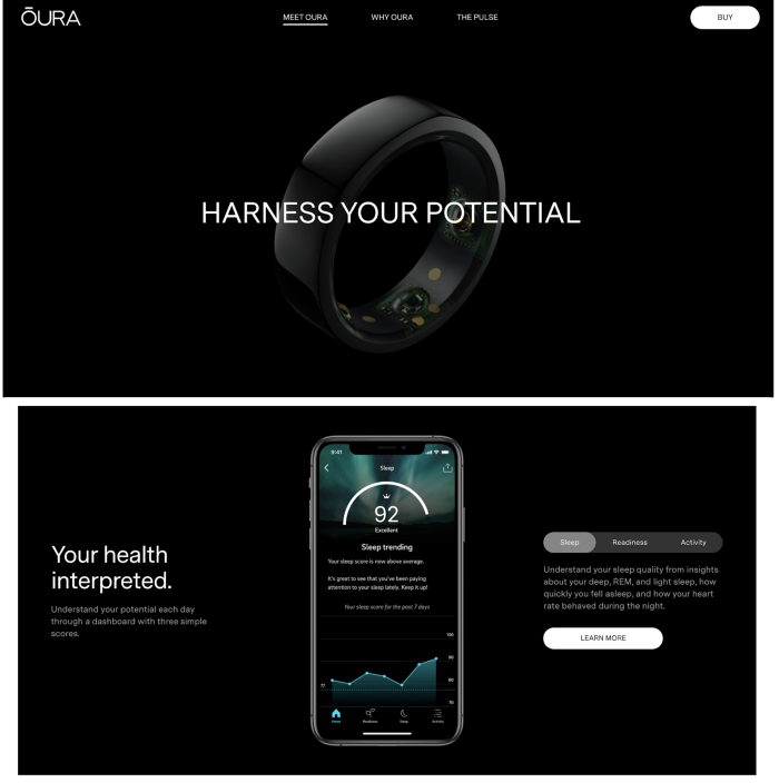
Screenshot from the author.
Here is another sales page for an online video course of mine. (Warning: minimum viable product-level design dead ahead.) At its very skeleton, I need to tell prospective customers how much video content they get, how the content is delivered, what those videos are about, and how watching the videos helps you achieve your goals. It doesn’t need to be a lot of information; it just needs to be clear.
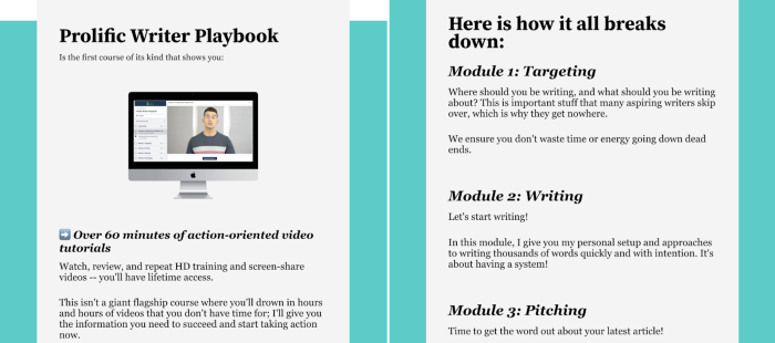
Screenshot from the author.
One call to action
The sales page is not a place for buttons to your social media channels, backlinks to other blogs, or backlinks to anything, really. Forking over money is painful, so when presented with more than one button to click, someone will always choose the less painful button. Disarm this option by having just one call to action.
Oura Ring does an okay job of this. They’re a new technology product and probably balancing sales with brand affinity initiatives, so their sales pages are more like product pages. You’re being informed about the product and can buy right there, there’s also a menu navigation up at the top.
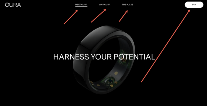
Screenshot from the author.
In contrast, my sales page has only one call to action on the entire page, though I have that same button appear seven times throughout the page so you don’t have to scroll all the way up or down to find it. You either click the button or peace out.
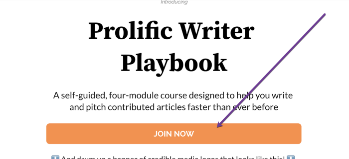
Screenshot from the author.
A sterile checkout process
Our brains are wired to associate spending money with pain, and consumers are often very skilled at talking themselves out of a purchase. Make the checkout process as clear and clean as possible to prevent hiccups.
You can achieve this for free with a payment portal like PayPal. If you want something more fancy, there are lots of marketing widgets to explore. I use ThriveCart personally so that I can take multiple payment types and also offer payment plans, coupons, and potential upsells, but PayPal or other payment gateways are free.
Also ensure that your website or checkout process uses encrypted and secure payment methods. Consumers are now so used to seeing little padlock icons and “secure checkout” language that when they don’t see it, concern may surface. Keep it familiar and ensure customers their payment information is secure.
Other Goodies That Make A Sales Page Sing
Once you have the bones of your sales page squared away, you technically have a completed sales page, and millions of dollars are traded each and every day on sales pages as lean as what I’ve described above. You could theoretically stop reading right here and still have a functioning sales page.
To improve your sales page and make it more lucrative though, let’s add in some other details that will help inform your customer and put them at ease. I’ve added to the aforementioned skeleton and put new elements in bold.
- A compelling headline and lede
- Your product, its features, and its benefits
- Urgency triggers
- One call to action + a sterile checkout process
- A guarantee
- Social proof
- Frequently Asked Questions
- Call to action again + a sterile checkout process
Headline and lede
What is the #1 outcome or result your customer wants? This informs your headline. Don’t focus on the how; focus on the why. A soap advertisement that promises a fresh clean feeling will outperform an ad that opens with talking about the wax, oils, and manufacturing because the former leads with outcomes and results. Social Media Marketing World, an annual conference hosted by Social Media Examiner, opens with what you’re going to learn at their event.
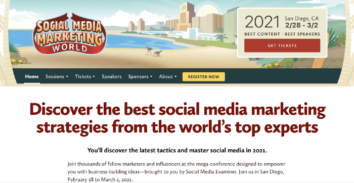
Screenshot from the author.
After your headline, you’ll go into your “lede,” which is a journalism word that refers to the introduction of a story (Pronounced ‘lead’, but purposely misspelled so that editors better understand the reference). In a sales page, the lede operates a little differently; the lede is where we want to ratchet emotion up, because emotion is what makes people buy.
Different entrepreneurs and writers like to approach the lede in different ways. You can incorporate any or all of the following written elements:
- Reader validation. A common one-two punch formula to put in your first few sentences if “If you’re a person/business owner who <insert detail>… Then here’s what you might not know.” It works because the reader can confirm early on that this product was designed for someone like them, and readers are scanning for these validating clues first to ensure they don’t waste their time.
- Personal story. Stories sell, period. If you have a great story to tell that illustrates yourself or someone else going from point A to point B, that story should go in your lede. For your story to work, we not only need to believe you did it, but that we too can achieve the same result.
- Reasons why they haven’t succeeded yet. Help me understand that my failures up until now weren’t actually my fault; I just didn’t have the right information or the right environment to succeed… right? Highlight the circumstances that are holding me back.
- The “one thing” that will get them there. I don’t want a 25-step action plan. I wanna know the one thing that will make the difference. This tees up the introduction of your offer nicely, because you can then illustrate how your product, program, or service delivers the one thing and gets results. Call it whatever you want, “X-Factor”, “secret weapon,” “competitive advantage” — it just needs to be one thing and feel easy to surmount.
Urgency triggers
Even if someone is sold on your solution, there’s a massive barrier you must overcome for money to exchange hands: “Why should I do this now and not later?”. FOMO is your best friend here, and there are plenty of ways to create this feeling ethically.
You can offer a limited timeframe to buy, a limited amount of inventory, or a time-sensitive discount. Amazon takes advantage of the power of urgency triggers every single day with their Daily Deals section. Notice the countdown clocks on some items and bars indicating dwindling inventory for others.
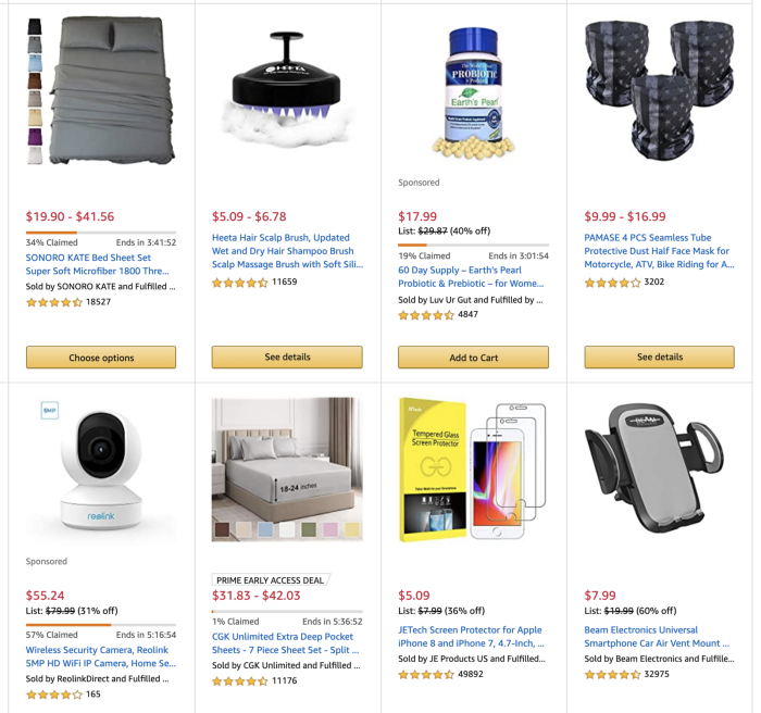
Screenshot from the author.
Another way to drive urgency is to point out that if action isn’t taken now, disaster could strike down the line. I’m not a catastrophist personally, but that selling style may be appropriate if your offer is legitimately time-sensitive.
A guarantee
You need some sort of money-back guarantee in a long-form sales page. Otherwise, seeds of doubt will stick in your reader’s mind, and this kernel alone can be enough to make the difference between sale or no sale. Eradicate these concerns with incredible confidence that your product, program, or service will achieve the intended results.
Frequently asked questions
If people have made it this far in your sales page, they’re curious. They may have clarifying questions, or they just have an inquisitive buying style in which getting questions answered helps them trust you. Either way, an FAQs section can be very helpful.
Social proof
Few things in this world create instant trust the way social proof does. Publicity, past awards, testimonials, years of experience or a large number of satisfied customers are all great ways to imply authority and credibility in a very short period of time. If you only place social proof on your page once, do it right after the “buy now” button; seeing the “buy now” button is painful and generates nervousness, so we need to offset those nervous and win back trust.
Social proof is actually so powerful and has so many flavors that many sales pages choose to incorporate it throughout the entire page. I add social proof subcategories in three other places in our template, which now brings us to the original outline I shared with you. It’s probably becoming more clear why some sales pages are so long: Every element adds a little extra morsel of trust or excitement, and when you add it all up, you maximize the chance that a reader will buy.
- A compelling headline
- Social proof: Media logos
- Lede (“If, then” clause, story, reasons why they haven’t succeeded yet, and/or the one thing that will make a difference)
- Your product, its features, and its benefits
- Social proof: Testimonials
- Urgency triggers
- Call to action
- A guarantee
- Social proof: Testimonials
- Social proof: Case studies
- Call to action
Extra Fluff Often Added To A Sales Page That Is Unnecessary
Did you notice there is no “About me” section in this template? You can create an effective sales page without going into a lot of detail about yourself or your company. If talking about yourself is a compelling credibility marker, either introduce yourself in the story section of your lede, or drop your bio in with testimonials as a form of social proof. Otherwise, a sales page can thrive without it being about you.
Also avoid using too much jargon or complicated language. Studies show that the most successful authors over the years wrote for an elementary school reading level. The best sales pages are dead-simple and easy to follow.
Make It Your Own
So there you go! Hopefully this gives you a sense of freedom around creating a sales page for your product, program, or service. Your sales page doesn’t have to feel like running a marathon, but it does have to give customers the information they want to move forward and buy from you. Make a sales page your own and watch interested leads and buyers roll in automatically.
Thanks for reading. 🙏🏼
Keep up the momentum with one or more of these next steps:
📣 Share this post with your network or a friend. Sharing helps spread the word, and posts are formatted to be both easy to read and easy to curate – you'll look savvy and informed.
📲 Hang out with me on another platform. I'm active on Medium, Instagram, and LinkedIn – if you're on any of those, say hello.
📬 Sign up for my free email list. This is where my best, most exclusive and most valuable content gets published. Use any of the signup boxes in this article, or go to the newsletter page here.
🏕 Up your marketing game: Camp Wordsmith™ is my business and writing program for small business owners and online entrepreneurs. Get instant access to resources and templates guaranteed to make your marketing hustle faster, better, easier, and more fun. (It's also "glamping"-themed – who doesn't love luxurious camping?!) Learn more here.
📊 Hire my marketing company: Hefty Media Group provides consultation and done-for-you services in content marketing. We're a certified diversity supplier with the National Gay & Lesbian Chamber of Commerce, and we'll make you sound damn good via the written word. Learn more here.
© 2021, 2022, Hefty Media Group. All Rights Reserved.