Instagram is obviously a good marketing platform choice for photographers, food bloggers, fitness influencers, and other visual brands.
But what if your online brand centers around writing or data? And what if your core asset is a website or channel other than Instagram? Is publishing on Instagram even worth your time?
Amidst an ocean of thirst traps and quote boxes, I pondered this question. But then I remembered one of my favorite accounts to follow: The Harvard Business Review Instagram.
5 Free Instagram Tricks I Learned From Harvard Business Review's Profile - Post Outline
Even when discussing complex management topics or reviewing scholarly research, the Harvard Business Review Instagram account creates an engaging content experience that is easy to follow and participate in.
Let’s take a look at 5 ways the Harvard Business Review kills it on Instagram, and how you can take a similar approach without coughing up a dime.
#1: Whenever Possible, Communicate Graphically
A well-structured graph, chart, or infographic communicates valuable information quickly and well, and immediate engagement is imperative if you want to stop the scroll.
HBR does this beautifully. Whether it’s in their feed posts, their Stories, or their Story ads, the information being presented is easy to comprehend.
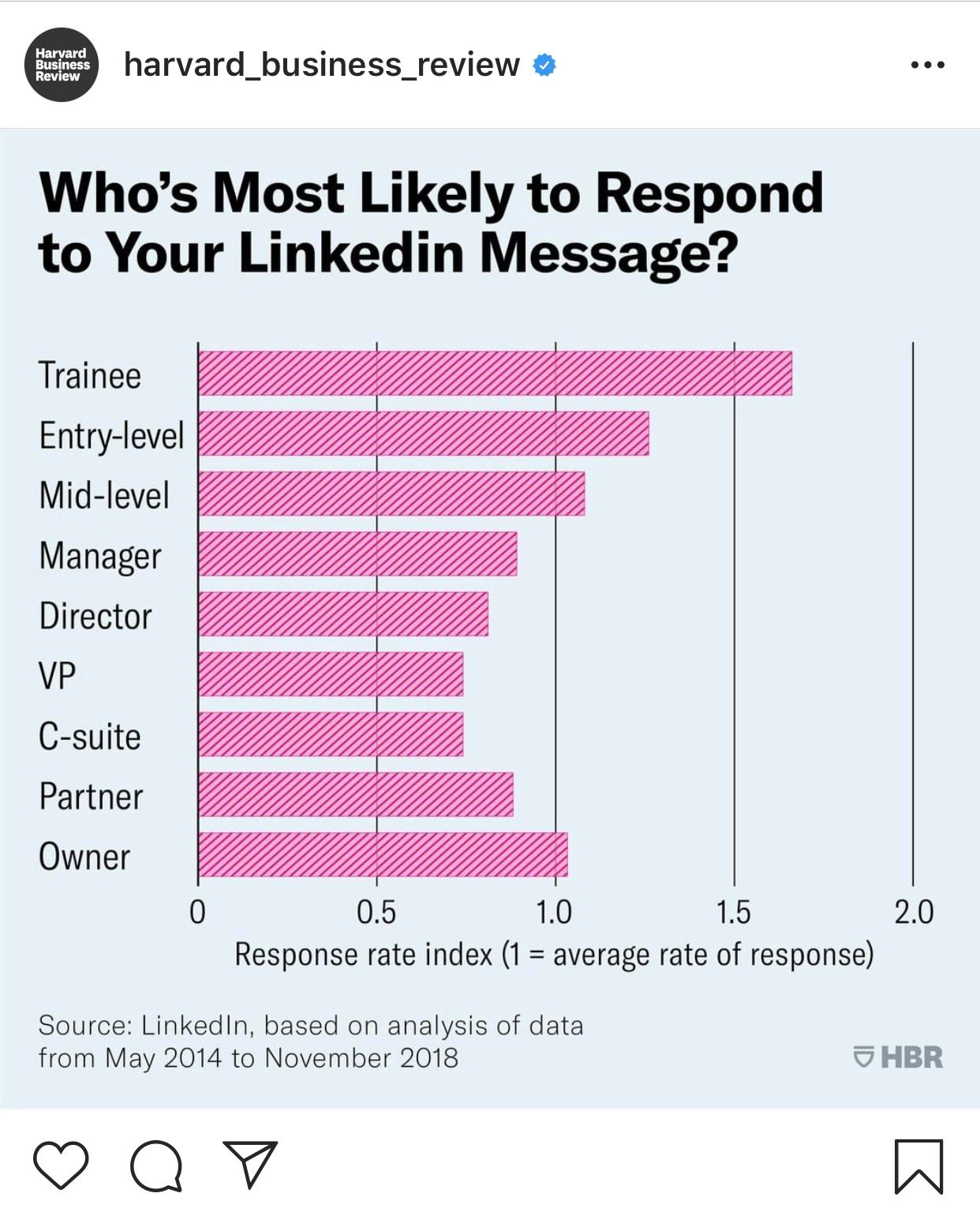
Like most publication outlets, my guess is that web traffic is a top priority for HBR. The majority of their posts boast a call to action to visit an article that dives deeper into the subject being presented.
The Harvard Business Review Instagram has content that piques our curiosity. But Instagram is not where their “source content” is - that would be their site. Instagram is functioning as an amplifier to their existing content.
Whether Instagram is the source of your content or an amplifier that directs people to another platform, visuals help.
If you’re not a designer and have no budget, no problem. Canva has really upped their game in the last year or two in the presentation slides department, and turning your data into visually attractive graphics can be a drag-and-drop experience.
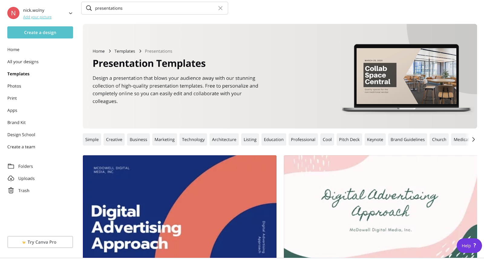
Canva is free to use. If you want additional upgrades like saving your brand colors in your account, there’s a monthly fee, but you can produce all the graphics you need within a free account.
#2: Stop Checkerboarding Your Feed For The Hell Of It
The alternating selfie/quote box feed is over, because we’ve now seen it for years. It’s overly curated, inauthentic, and not how real humans use Instagram.
Trust me, I love structure and crisp design. But a nonsequitur feed actually draws the eye in more, not less. It’s disruptive, and there’s actually more to look at.
We don’t want clean. We want curious. Curiosity leads to clicks and sales, not cleanliness.
Look at these two screenshots. Which makes you more curious?
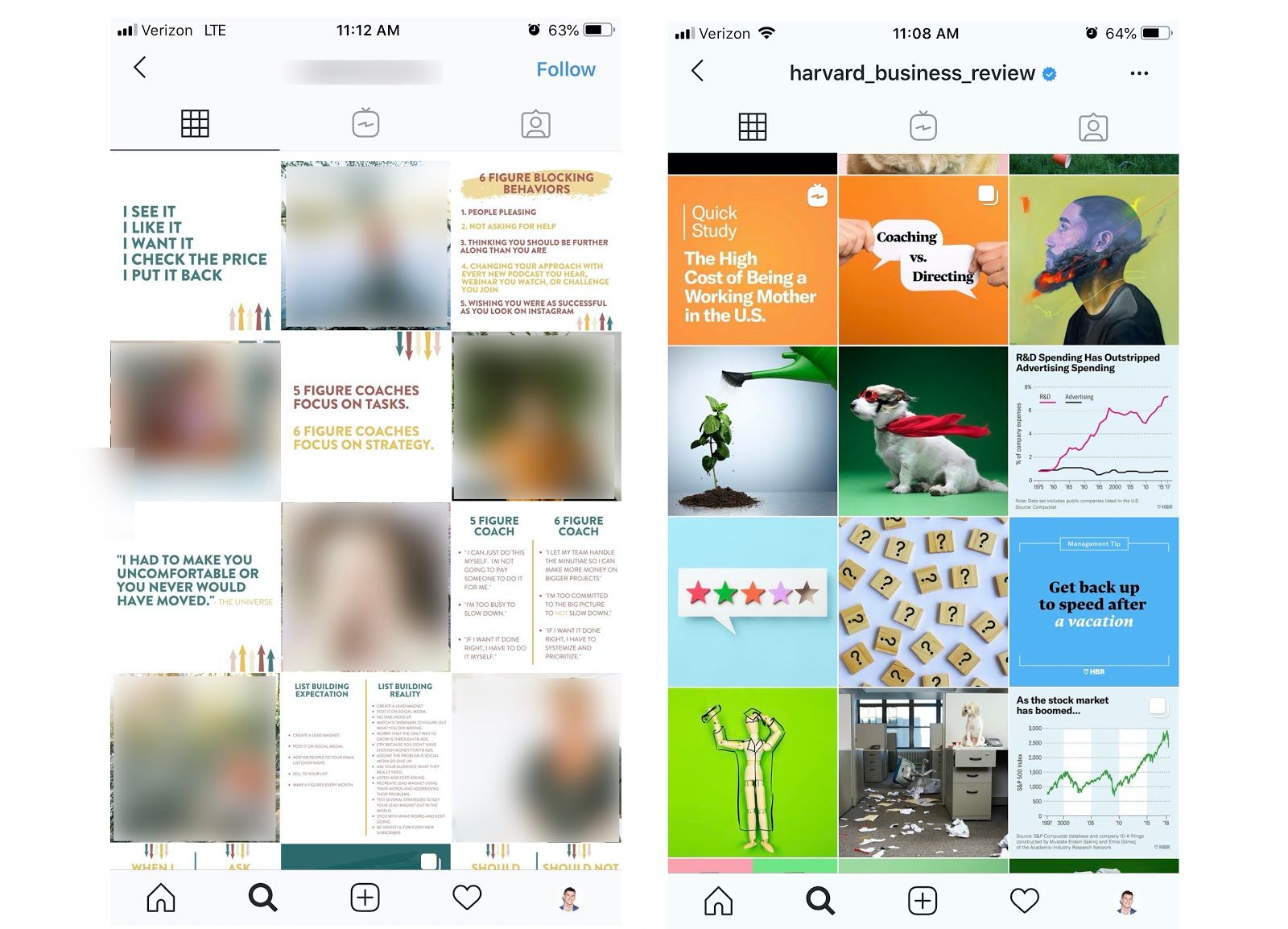
The curated feed on the left, while clean and aesthetically pleasing and perhaps even superior in design, is predictable.
Even brand colors don’t matter anymore. Look at these feed screenshots from Entrepreneur and The Economist; they’re random and spastic with the lightest of branding guidelines, yet they also scream quality.
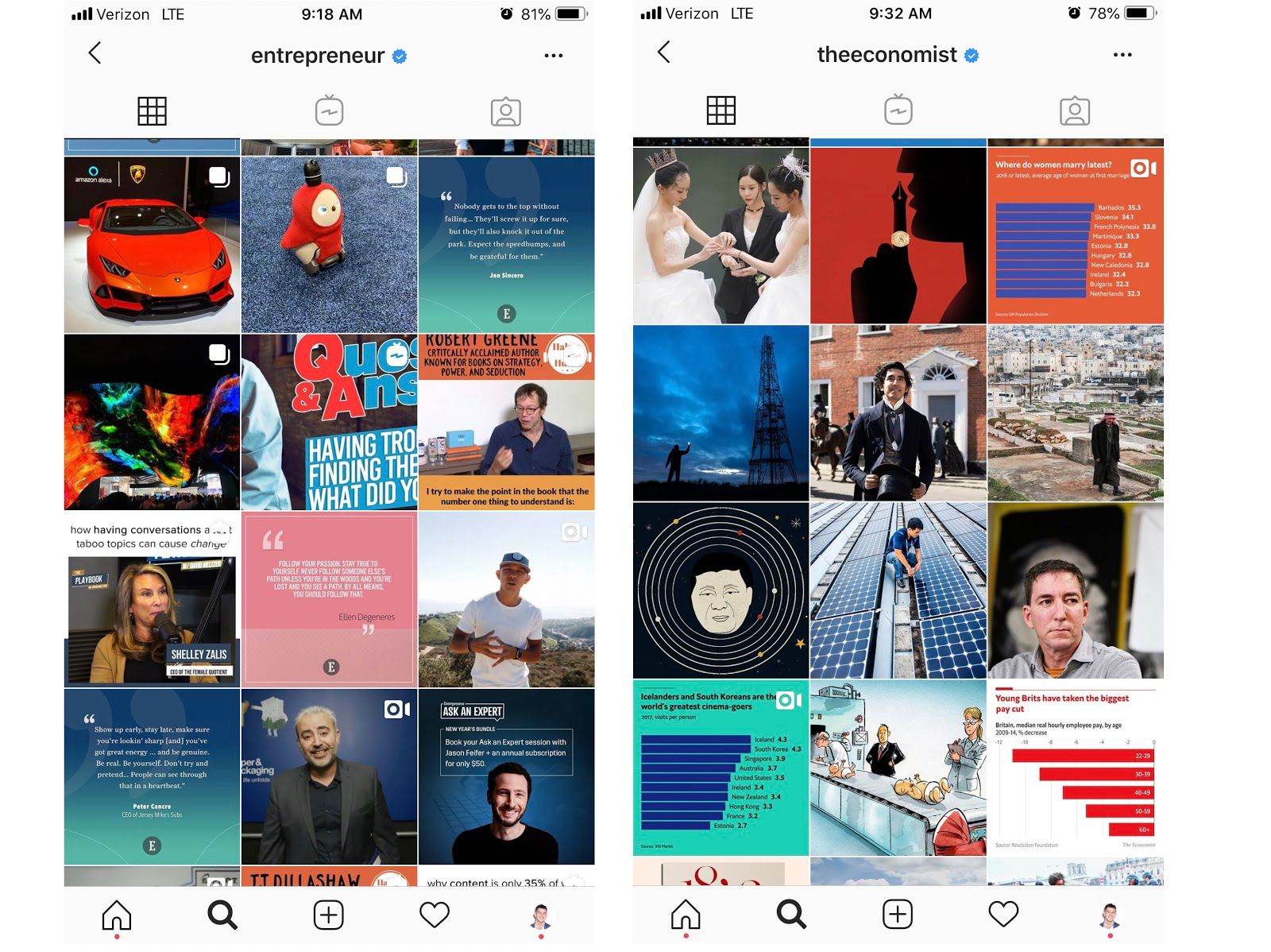
They leave you curious. Meet and surpass the bar on quality, and you can do whatever you want in your feed.
#3. Line Breaks Make Captions Cleaner
It was tricky there for a minute to make Instagram captions feel editorial because Instagram forces hard line breaks, smashing your beautifully constructed paragraphs together into an amorphous blob of text.
Luckily though, more people are learning about “invisible characters” - characters in a keyboard that are like spaces, but that Instagram thinks are characters, so your whitespace will be held.
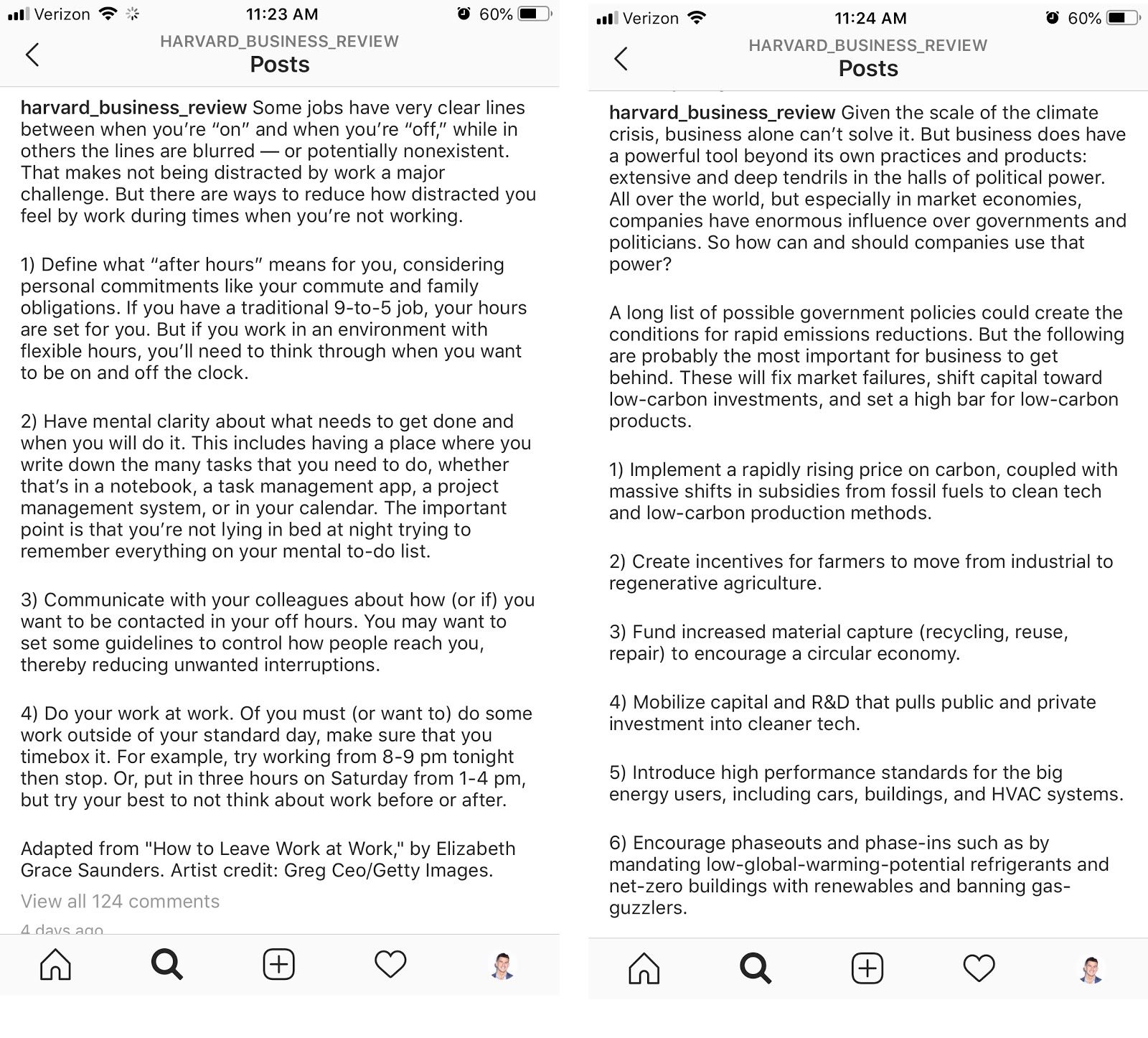
These Harvard Business Review Instagram posts, for example, have an invisible character between each paragraph that is holding the whitespace, making the copy easier to read.
I have this website bookmarked; it’s a no-frills generator that adds invisible characters to all spaced lines for you. Just place your caption in the box, click copy, and the characters will be added and held.
You may have also noticed a rise in different fonts on Instagram captions. HBR doesn’t do this, but seeing as it’s proliferating on Instagram, you may want headings or subheadings of captions to appear in a different font.
There are several font generators out there. I liked the cleanliness and ease of the one produced by meta tags, which is here.
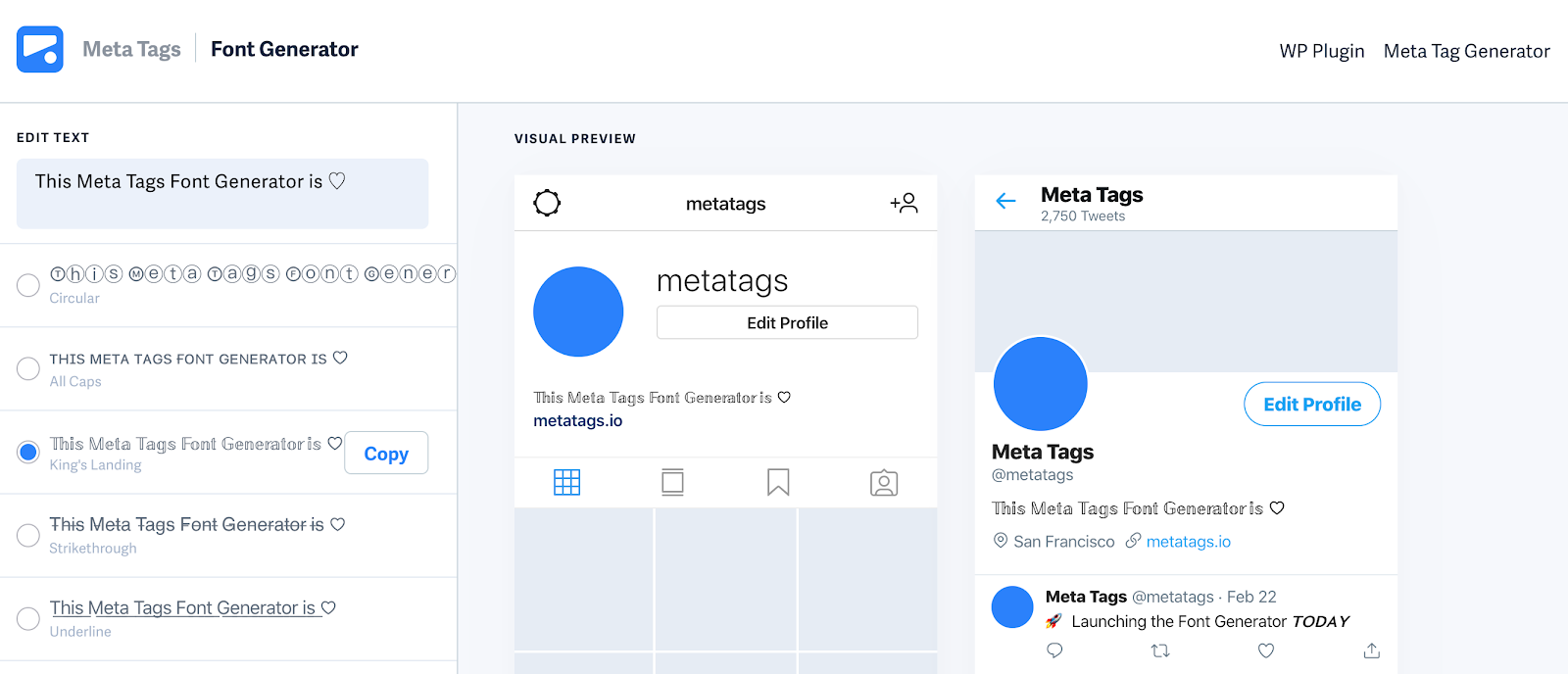
There are some wild font options out there, y’all. Luckily, there are also simple bold and italic fonts; if you italicize for emphasis in your writing, you may want to incorporate this style upgrade.
#4: Milk Your Profile Link With A Plug-In
One reason I spent so much time exploring HBR’s Instagram is that each post has its own call to action, and all of the historical calls to action (aka outbound links) are still intact and clickable, months or even years after the original post was done.
You really can have tons of links on Instagram if you want. The key is to use a third-party app or plug-in that turns your one profile link into multiple links.
Your free option is LinkTree. This handy little app opens a menu of links that you can custom-title, and there’s no limit on what to create. LinkTree also has a paid version if you want more branding control.
If you plan to do more direct post-to-post promotion, a Linkin.bio or Have2Have.it may be viable options.
Harvard Business Review and many other editorial outlets use Have2Have.it. I like Linkin.bio, but that’s because I already use the Instagram scheduler Later, so I can populate the links and add to the menu while scheduling socials.
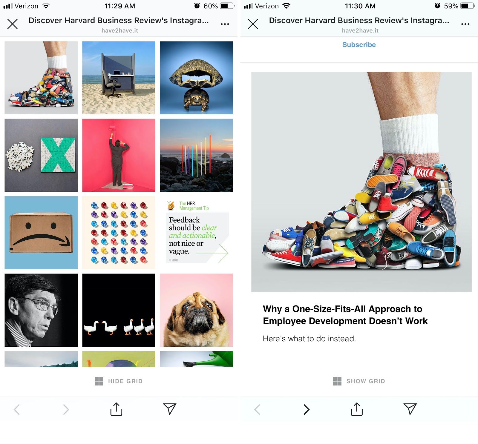
This way, you don’t need to keep changing your one link each time your promotional strategy changes.
If you’re running traffic to a website, consider setting up Google UTM parameters, which allow you to create unique links to a post and categorize your traffic. Knowing whether 80% of your traffic is coming from IG posts, searches, or a Reddit thread can be really valuable.
#5: Story Highlights Drive Traffic
Businesses account for a third of all stories posts, and an astonishing 20% of Stories posts elicit a direct message from a user. In 2017, Story highlights were added, making story content more attractive to creators who don’t want their hard work to disappear after 24 hours.
HBR takes it one step further. Every feature story they do has its own Story highlight. Each story tells a story, then has a call-to-action to that unique article.
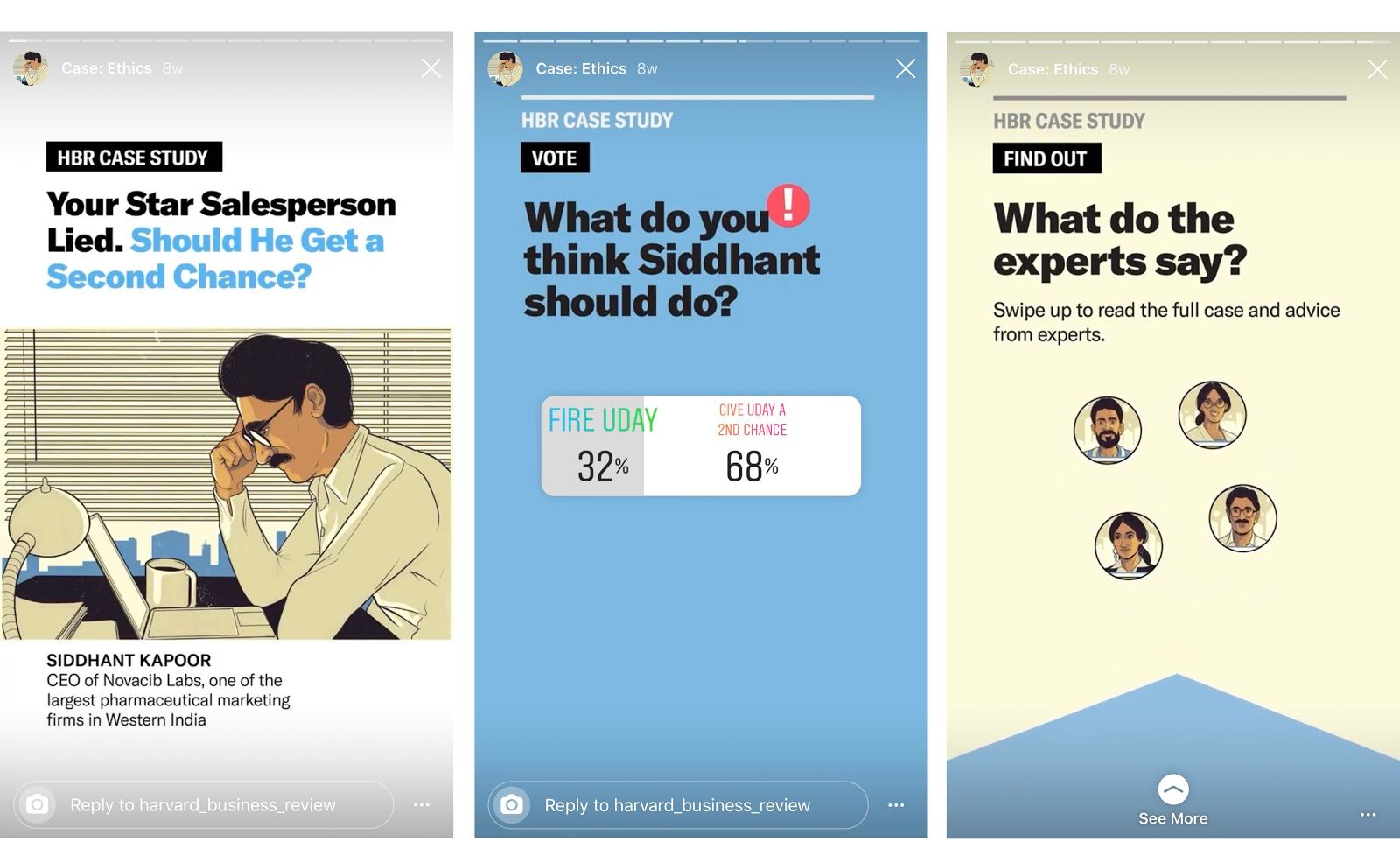
It’s compact, digestible, and interactive. HBR leverages tight design and simple animations, but also uses the engagement tools of Stories to great effect.
For example, they use the poll function to test users, then reveal that the same question was used in recent research, and that an article is communicating the results.
The swipe-up feature is reserved for users that have 10,000 followers or more, but when it comes to driving traffic, there’s an easy workaround.
Now that your profile link is an encyclopedia of outbound links and goodies, an easy solution is to tag your own profile in a Story, then put a sticker over your tag so it functions like a button.
While it isn’t exactly the same as a swipe-up feature, if your content is compelling, users will do what it takes to find out more.
So there you have it! Hopefully, this gets you inspired on some new and different ways to use Instagram as a traffic driver, even if you’re not a supermodel or dog influencer… yet.
Thanks for reading. 🙏🏼
Consider taking one of the following next steps:
📣 Share this post with your network or a friend. Sharing helps spread the word, and posts are both easy to read and easy to curate – you'll look savvy and informed.
📲 Join the party on another platform. I currently create on Medium and Instagram – come say hello.
📬 Sign up for my free email list. This is where my best, most exclusive and most valuable content gets published. Use any of the signup boxes in this article, or go to the newsletter page here.
🏕 Join a community: Camp Wordsmith™ is my business and writing incubator for entrepreneurs. We open doors for free challenges and enrollment throughout the year. Learn more here.
📊 Hire my marketing company: Hefty Media Group provides consultation and done-for-you services in content marketing. We'll make you sound damn good using the written word – reach out to us here.
© 2021, 2022, Hefty Media Group. All Rights Reserved.

